Monday, May 25, 2015

It's been a while...


So it seems that even those who enjoy blogging can have a bit of a lag in posts. This weekend was a slightly different weekend from most as I found out I had actually passed my exams. I had had the fear for the entire week leading up to results and finding out they had been released at the beginning of Friday's session was probably one of the worst scenarios as it left almost a 2 hour window where we had agreed not to check (longest 2 hours of my life). But I'm back now realising passing the exams and OSCEs means nothing if I don't pass this SSC so back to blogging I go.

Turns out it's normally around the 18 month mark people tend to give up their blogs, or at least lose interest. There seems to be a couple of theories around this, one of which being that people start blogs with the intention of getting them out there and well recognised and possibly making money off of them, but unfortunately that's not something that happens with all blogs, and I guess 18 months must be that point where it feels like you've dedicated quite a lot of time to it and reaped no rewards. I mean I think that it's a pretty similar length of time to getting pregnant, having the baby and then the maternity leave altogether, but I mean you don't expect to have a fully functioning human being by the age of 9 months, it's something that is constant and the baby is constantly growing just like your blog if you just keep working at it.

The presentations on Friday were great, Grace's, like my own seemed to focus on the actual principles of designing an e-learning resource, whereas Adeeb, Eric and Lukman's presentations focused more on the global introduction of technology into education. All the presentations together I felt gave us all a good idea as to both the advances in technology used in education and also the limitless possibilities for education in the future.

In terms of my own project this weekend has been spent thinking about what to do next, how can I best improve my project and make my learning resource as useful as possible?

I took a lot from Grace's presentation in order to answer these questions. It was mentioned that reems of text aren't really the best method of getting important information and that worried me, because at points there is quite a lot of text in my learning resource. However, when I had a think about it I realised that this text was actually further information. I had to think about what my learning resource was trying to teach exactly and how it was trying to teach it, and rather than being a source of the scientific information or a source of answers it is a source that is supposed to enable you to make the correct choice in a situation. It then provides answers and explanations for those that need them and want to know why a certain answer is incorrect, but generally speaking it is more a run through of a scenario that should enable a person to act safely and efficiently in a ward scenario.

Tuesday, May 19, 2015

Question Time

So today was another meeting and once again we were spoiled with cake and coffee, which always makes the morning sessions that little bit better.

I must say everybody's projects are looking great, they all seem like something that should have been created 3 years ago in time for us starting so we could get the maximum benefit from them and it is that thought that lead me to think about all the resources we've come through the last three years using.

A number of students before us have created learning resources as part of their SSC or 4th year project and I'm sure they all felt the exact same way about their projects, or projects that other people had developed alongside them. So why do we always feel they are not good enough? Is it because we expect too much from people? Is it because we feel we can do a better job? Or is it because things don't tie together well enough?

I think that some of the issues with previous learning resources is the fact that it is generally additional information that we are being provided rather than information to go alongside teaching we have already been given, or there are certain aspects in tutorials that involve new information, and this is something we don't like. We don't like sitting down to go through one of these online resources and it turn out we don't know any of the answers. These should be something that should help us consolidate knowledge we have already attained and can utilise rather than prompting us to go off and learn more by ourselves just to answer one question in an online tutorial.

I think this stems back to what everybody was saying today, that it is very hard to get consultants to review pieces of work or to provide the necessary information in a timely fashion meaning that you get a tutorial that contains information and asks questions, but they're not always entirely relevant to the teaching we have received. One example of this was back in first year when the ISS modules during GI were not in sync with our gastrointestinal teaching and meant that we were clueless when it actually came to answering them.

It is my thinking over this that has resulted in me coming back to the flat to have a good hard think about what exactly I want to achieve with the actual informative part of my learning resource, namely the blood transfusion scenario. There are a number of different methods that I can use to convey information and to determine whether or not learners can comprehend it, however I think if I focus more on having a tutorial where I talk them through individual steps they can then put those into practice, as my tutorial is not going to focus on the science behind a disease as such but rather the correct management and maintaining patient safety.

So if anybody has any thoughts on necessary facts when dealing with a acute transfusion reaction I'd be happy to hear them as it's about time I started filling my resource with all the necessary information.

Monday, May 18, 2015

e-Learning and the Science of Instruction

So on Wednesday I chose this book to have a read through over the past week. Unfortunately it was the largest of all the books on offer and had a hardback cover...just my luck. But turned out to be quite useful as chapter 16, 'Simulations and Games in e-Learning' was very relevant to the tutorial that I have been creating.

E-Learning and the Science of Instruction - Clark, R and Mayer, R
There were 6 key principles highlighted in this chapter that are necessary to create an effective learning resource in the form of a game or simulation.


Principle 1: Match the game types to the learning goals

There are a number of different types of games out there, strategy, puzzle, action adventure...the list goes on. So it is important to ensure your game type matches the actual information you would like to teach.

For example my game has the goal to teach students how to navigate a ward and how to prioritise which patients to see and when, so instead of using a first person shooter style game, I opted for a simulation style similar to what you might see in The Sims.

Principle 2: Make learning essential to game progress

Basically anything that allows you to proceed through the tutorial/game should actually promote learning and be informative, rather than just a question for the sake of asking a question. It should all relate back to the learning objectives that are provided at the beginning of the game.

Principle 3: Build in proven instructional strategies

Including different types of question and answer formats. More importantly explanatory feedback rather than just correct or incorrect feedback. This is something I have been attempting to do for my simulation especially since the format of our exams is a 'most appropriate answer' style question, where they may be more than one answer that could possibly be right but in this particular situation only one can be correct.

Because of this style of questions I feel like every single possible answer requires an explanation so that people can see where they went wrong or why a certain answer is better than others.

Principle 4: Build in guidance and structure

Discovery learning where by the operator has to go through the tutorial without instruction does not really promote learning.

Due to this I have tried to include small parts of information to instruct users on what to do next or what will be expected of them as the progress through various sections of the tutorial.

Principle 5: Manage complexity

This is something that could become quite important if this format of tutorial were to be adapted across all 5 years of the medical school as many different years are at different levels due to the increased knowledge gained. One possible solution to this would be to have an initial screen allowing you to select your year group and then advance through various scenarios that are more tailored to your own level. Obviously there would be nothing to stop younger years from attempting a harder scenario however some of the information may be too difficult for them to comprehend.

Principle 6: Make relevance salient

Once again this sort of ties in with matching the game types to learning roles. For example certain genres of games may make the tutorial more fun and engaging but many users may struggle to relate it to their actual jobs and therefore may find it to be a waste of time to complete.


Workin' 9 to 5


Ok, ok, so it was over 3 days but that doesn't make for a witty title now does it? So 8 hours of work between my project and reading for the SSC this weekend. Although in the total number of free hours I had between Saturday and Monday I only worked for 8, I feel they were pretty solid working hours, no interruptions, no trips to Facebook and no stopping until I had done basically what I wanted to get done that day.

I started Saturday with one main goal: Solve my PowerPoint to Articulate problem. Turns out it wasn't as difficult as I thought it would have been.

Ok, so first I started with breakfast...
You see Articulate Storyline really hates my PowerPoint by the looks of things, however Articulate Presenter, only mildly dislikes it. Every time I went to play my presentation back through Storyline I just saw some mess of colours on the screen with randomly moving animations all over the place which I had absolutely no idea how to fix. Presenter on the other hand just messed up both the directions and the order of my animations. This was a nightmare as the animations took me the guts of about 3 or 4 hours to get the timings right, but also they are kind of key to the whole overhead game scenario that I have developed as part of this learning resource.

What to do, what to do?

As I mentioned in my previous post, I was planning to use PowerPoint in Kiosk mode to get around this issue with Articulate. Now Kiosk mode is basically where you have your PowerPoint presentation running automatically and people can not advance the slides or go back unless there are specific links within the presentation that will allow this.

This seemed like it was going to work out even better than Articulate. With our University accounts we all have access to Office 365 which includes Microsoft PowerPoint Online, So if I could get Kiosk mode to work then all I would need to do is 'save as' a Presentation file rather than an actual PowerPoint file, this way it would always only ever open in the slideshow.

"Why Michael, what a brilliant idea", well this is what I was thinking, although I'm sure anybody who is totally familiar with Kiosk mode is probably sniggering behind their computer screens at the sheer ignorance of myself.

As I mentioned above, animations are a key part of my resource and the ability for them to play is also key. It turns out in Kiosk mode, even if you have set animations to begin when the slide changes, they just don't seem to do it no matter how much you shout, scream or cry at your computer (take my word for it).

Ok so actually as I was typing this post to re-cap the whole weekend's work I decided to check up on this again, just to make sure it was actually the case before I published this and made a fool of myself. Boy am I glad I did that, turns out for some reason Kiosk mode just wasn't working the first few times I attempted to use it, and now it's working perfectly fine.

So this means I've now got two possible publishing methods. The tutorial can either be launched as a PowerPoint Slideshow file, or with Articulate.

I managed to get around my trouble with Articulate Presenter by changing some of the orders of my animations. It turns out it doesn't like it when an object has a 'motion path' before an 'entrance effect'. This meant I had to accurately place my characters at the best starting position so it looked like they were coming in as the fade entrance effect was happening. This was a relatively minor fix and seems to have helped my issues.

On top of solving my actual functionality issues I have added a lot more sections to the tutorial and have now reached 50 slides in total, with many more to go.

I visited clinical skills on Friday afternoon after our session to ask about setting up the scenario to take a picture of for the resource, however the first opportunity I have isn't until next week as final year OSCEs are taking place.

I've been wondering whether or not it would be easier/get it sorted sooner if I got permission from a patient in the transfusion suite who is receiving a blood transfusion?

Other than that I have just been flicking through all the slides as a slideshow to identify any links that don't seem to work or any that link back to the wrong page. Fortunately there weren't too many and I have managed to get all that are currently there working. I'm glad I sat down and did this, because I know it's the sort of thing that I would have left until the last minute normally as a touch up job not actually realising how much needed fixed, meaning I'd probably have missed something quite important.


Something I'm glad I noticed and fixed was a possible issue with the 'Whiteboard' and 'To-Do list buttons'. Now the function of these buttons was to open either the Whiteboard or To-Do list at any point during the tutorial just for reference, in light of this the hyperlink added to the 'Back Button' was 'Back to last viewed slide'. This meant you would always be taken back to the slide you were last viewing. The problem occurred if you were in the To-Do list and entered the Whiteboard, or vice versa. In this scenario you were trapped between the two slides as the last viewed slide was one that could only take you back to the last viewed slide.

Getting around this ended up being really quite simple, but took me a while to work out as I thought it was going to require quite a bit of thought. All I had to do was remove the ability to jump straight from the To-Do list to the Whiteboard or vice versa. This meant I had to change the layout of the slides a little. Previously I had a 'Go Back Button' when you were in either of these two extra slides. Now I have an X in the corner which has the exact same hyperlink, but makes it more obvious that you are opening and closing these documents rather than just seeing them as a slide in a sequence.

New layout for To-Do list
As you can see above I have included the new layout To-Do list, with the new 'X' button and the now removed 'Whiteboard' button.


Friday, May 15, 2015

Houston, we have a problem


It was all going so well too, had our sixth meeting today and showed our progress with our projects and I must say, they're all looking great. Like I know for a fact everybody's will be of benefit to the entire medical school and think that future students should get quite a bit from these resources.

But the problem. Well as I mentioned today, my PowerPoint animations and colours are not really moving very nicely between PowerPoint and Articulate. Now this is not very good as Articulate is the viewer that I am going to have to use to allow my project to have its learning resource functionality, so I either need to find out how to make it transfer a bit more smoothly or come up with some form of alternative.

The best thing about Articulate is it means I can stop users from skipping ahead in the presentation and can prevent the presentation from running through the slides in the order they are created in. A solution in PowerPoint would be to run the presentation in 'Kiosk Mode'. This works well until I get to the slides where I need animations to start as soon as the slide opens, but I don't want the slide to automatically progress to the next slide. For some reason in these slides the animations do not begin until something is clicked, which is something I would like to avoid.

Does anybody have any ideas as to how I could solve this, it may be hard to visualise just from my description, so I will demonstrate the issue at Tuesday's session, but for the next few days I'm definitely going to be working on it and trying to find some form of fix.

Or possibly if +Tom Kuhlmann, who writes The Rapid E-Learning Blog had any suggestions I would greatly appreciate it.

Some more furnishings


So playing around on Microsoft PowerPoint this morning I have manged to come up with a few more furnishings for the ward, the iconic teal/blue/aqua/one of those in betweeny coloured chairs and the bedside tables. So finally I'm starting to get the finishing wee touches to the aesthetic side of the resource, which is great and all but still content is lagging massively behind.


I think at the minute I feel that because actually doing the aesthetic side and the animations are part of the resource it's technically not slacking. However I still really need to focus on the actual content before I leave myself an awful lot to do in a very short space of time.

Thursday, May 14, 2015

Interesting Talk


So I was just on YouTube this evening and came across an interesting TEDx talk from 2012.


I have fast forwarded the talk to the main point, where he talks about specific learning methods and that students actually learn information in the wrong way and don't tend to learn it 'in a way the brain likes'. 

This is something similar to the cognitive load theory we have been discussing in our sessions, and from this talk it seems that by optimising your learning strategy the amount of information you can retain is vast.

Oh an idea...


Previously, for the blood transfusion reaction scenario in my learning resource I had intended to build what looked like a patient lying in a bed receiving this transfusion. However I have been thinking tonight about how best to go about doing this and had the idea to set up the scene in the Clinical Skills simulated ward and have this as the picture thus bring about a sense of reality to the tutorial.

This I feel is needed as my flatmate had a look at the tutorial yesterday and said it looked good so far, almost like a game, which is similar to +Annie's comment that it was like The Sims. I like the fact that it is like a game, I like the idea that people could possibly enjoy using this resource and learn something from it too, however the idea to use real life pictures (after gaining appropriate consent of course) is something I feel will help the user realise that although this isn't real the scenarios could be real in just a couple of years and then they will actually need to know how to cope if put in that situation.

So basically what this is about is asking +Adeeb Naasan+Eric Cheng+Lukman Hakim Abdullah  or +Grace Singleton if either of them would like to be patients for this resource.

Oh the endless links and animations

Ok for some reason this post disappeared reverted to draft, as far as I'm aware this wasn't something I did, but hey I'm new to this so it's a shock I haven't accidentally deleted the entire thing...

Had play around today trying to get all the ward based animations put into the overhead scenario so that I have that all out of the way, whilst I have a chance to sit down and just hash it all out.
Biggest difficulty: Inability to start a new slide where the old slide left off.
This is an absolute nightmare, means I've had to resort to placing my characters close to where they should be then flicking between slides in slideshow mode to nudge them with my arrow keys into as close a spot as possible. I mean normally if I were making a presentation with animations 'pretty close' would normally be ok for me and I would just accept it, however since this is actually going to be a learning resource I don't think it would be too nice for people to be working through it and have characters jumping a millimetre or two every time the slide changes.
Then there are the hyperlinks, links to provide immediate feedback. This isn't as bad as the animations but it just takes time to remember to put all the links in and also to ensure they're linked up to the right slide, otherwise you have to go back find the link and start again. For the majority of responses it's lucky that I can just link a number of buttons to one slide as a piece of feedback, but as I get further into the resource, slightly more detailed and less generic feedback will need to be provided so I can see this becoming an issue.
But anyway here's a video of some of the animations I've created today for you guys to have a look at...


Wednesday, May 13, 2015

Pretending to be arty

So after having sat down and attempted to work at a storyline, I have come up with a brief sort of summary of my slides.

Now because of the way I am actually doing this tutorial there will be quite a few more slides than I have drawn out, but the hope is that this shouldn't be too difficult to do and just requires a little bit of thought.

I took a little video of my A5 pieces which I will now upload both here in this blog post and over on the resources page so you guys can see all the individual parts starting to come together.

Excuse my terrible writing and drawing

The First Scan (Day 10)


So today was the first opportunity to show off what we have completed so far in our learning resources and get feedback to help us as we move forward with our project. This made me realise something that I think in the last sort of week I had put to the back of my mind and kind of forgotten, our learning resource actually has to be as factually correct as possible and actually teach something correctly.

Well duh, I can hear you all shout at your computer screens, obviously this was the point of this project. But let me explain why this, not so small detail, had managed to slip my mind.

ART

Bluh, ever since school I have never enjoyed the subject, I have never had any interest in it and just wanted the class to end as soon as I walked in. I mean how can you teach somebody to be better at art? Sure you can help improve somebody's technique or show them new skills, but I personally feel there has to already be something there to actually work with, and if you don't have that, well that's just it.

A visual representation of my reaction to art class

So the creative side of this project has been quite daunting and I think up until now I have been so engrossed in the visual aspect of my learning resource that I have neglected the main body and key function of it...to impart knowledge onto other students.

It was today as I was presenting my progress so far that this finally hit me it was mentioned that in some cases the order for visiting patients may not be as simple as I had originally planned, as in certain circumstances patients took priority over others which I had not totally factored into my scenario. The point was also made that if I did just continue the way I was going I would need some form of explanation as to why you were seeing this patient over another patient. 

So today after my first showing to the group I have decided that I am going to take a step back from the creative side and try to have some form of storyline created in order to be able to look at the facts and be able to make the most  informative tutorial I can, that hopefully kind of looks good too...


Homemade A5 pages at the ready!


Tuesday, May 12, 2015

Life after SSC


I have been thinking a little today about my blog. I don't think I've mentioned yet that this is my first time ever writing a blog or even trying to use blogger with Google. However if I have mentioned it I apologise for being repetitive but you'll just have to deal with it, after all you chose to come here and read stuff I'm writing.

But the thought today was not around my project and learning resource but rather, what will become of my blog when I'm finished?

Should I keep it or just leave it forever in the dark, cob web filled corner of the internet where only the most specific of searches will send the google spiders crawling in its direction?

Important questions that I will be thinking about over the next few weeks, as I'm quite enjoying having the opportunity to just write down a few thoughts every now and again, although that could mean my blog title may be a little bit obsolete very quickly.

So keeping the blog would possibly require an entirely new subject matter, and I don't know if I personally can think of anything interesting enough to write about.

I suppose for now we shall just stick with the Dr as a Digital Teacher blog and just water and see what happens when hard decisions need to be made.

+Adeeb Naasan , +Grace Singleton+Eric Cheng+Lukman Hakim Abdullah have you guys had any thoughts as to whether or not you'll keep your blog going?

Monday, May 11, 2015

Conception (Day 8)


And finally the day is here, the day where my idea begins, the day from which all my creativity shall henceforth stem. 

Commitment is such a hard thing, even if it is just with an idea, but I have now decided and have even made a slight start so there's no going back now...wouldn't want those hours working at a weekend, (yes you read that correctly, a weekend) to go to waste.

So I have started designing what I'll say for all intents and purposes is a hospital ward, and it looks a little something like this...
Welcome to Ward 99

Not a great representation of a ward, but hey it's my first time actually attempting art without being forced to do it.


Next I attempted to make my introductory slides, I have included a presentation with the first slide in it, where I then break it down into its individual components to show how it was constructed...


All the shapes were drawn in PowerPoint with the exception of the Doctor character, who was taken from those available on Articulate Storyline '13.

Sunday, May 10, 2015

Going blog crazy...


In a break from the latest activity we have been given as part of our SSC I decided to take the time today to try and beautify my blog a little. After taking a trip to see some fancy new fonts, I have now adjusted my blog posts accordingly, as well as adjusting the width of the blog to accommodate my ridiculously large mind map. 


Playing around with the fonts and actually utilising them was good fun, especially once I finally learned how to use them in my post (thanks again to betatemplates). I still struggled however to apply the one font style to the entire blog post one quick and easy step and actually ended up going through the HTML of the post page and changing each font style individually...surely there has to be a simpler method of doing so and any solutions would be greatly appreciated.


Other than that I am still working on my latest activity which should be going up in the next few hours but thought I'd have a wee chat about my fun day developing my blog a little further.


As an update to that, have just found this handy video...


So now I'll know for future reference and not be so silly and waste so much time individually searching my HTML for ''Font Family''

Still planning (Day 5)

A look at presentations today. We've all seen one or even done one, good ones, bad ones and then just totally ridiculous ones. But what actually makes a presentation good or bad? Well it totally depends on who you ask I suppose, but here are a few of my thoughts.

Good presentations:


Good colour scheme

  • Blue background, yellow writing, that headache from straining my eyes is going to last all day long


A bit of humour

  • A funny picture or two throughout the lecture to just give you a break and prepare for the next stage, generally these are well placed after a specific topic


Summary slides

  • Not a slide at the end of a 100 slide lecture trying to summarise everything, but rather numerous slides summarising each of the key concepts within the lecture. 
  • These are handy for revision when you understand the majority of the topic and just need a quick recap of concepts


An appropriate list of learning objectives

  • Not just those that the lecture covers, but those that are actually relevant to the course
  • A number of lectures actually list everything they talk about in the LOs and then when it comes to the lecture tell you, ''Actually this is never something I would expect you to know in an exam'', if that is the case it a) shouldn't be in the LOs and b) possibly shouldn't even be in the lecture
  • The learning objectives should be something people can go back to and ensure they understand everything they need to for the exam and future but should not just be essentially a contents page for the lecture


'Good' Diagrams

  • Not too small, not pixelated and everything is labelled correctly
  • Also they can't be too 'busy', these diagrams are complicated enough without tonnes and tonnes of information being included on them  
Trying to decipher a terrible diagram
All these good points I have mentioned refer more to the actual presentation being given and not the actual presenter, who can have a massive impact either positive or negative on the effectiveness of a presentation. If they do not care about what they're talking about or do not know a lot about the subject that shows, and is generally reflected in the presentation you see...

Lack of knowledge...
  • Entire script on the slides


Lack of interest

  • Gives a talk that includes everything but doesn't engage students and PowerPoint is lackluster and thrown together last minute
So a bad presentation is usually made when somebody ignores the five good points I have already mentioned, but also having presenters who literally do not care is never good.

Some extra things to think about when giving a presentation
  • Can everybody see?
    • Too small?
    • Too full?
    • Too dark?
    • Too bright?
  • Can everybody hear?
    • Microphone?
    • Hard of hearing?
    • Deaf?
  • Can everybody understand, not just the concept, but the language?
  • Are people paying attention?
    • Do they have the powerpoint available?
    • Does the environment promote learning?
      • Too hot/cold?
'DON'T USE BULLET POINTS'

I can see where this statement comes from, numerous lectures and presentations I have seen have a slide with far too many bullet points, each with a sliding in animation making what should be something very short very very very long.

However I disagree that you should do away with bullet points altogether, yes there are lots of other more creative and aesthetically appealing ways to get your points across, but sometimes bullet points are warranted when you want to make a simple and clear message, especially in teaching. Individual words on slides are meaningless to somebody who takes away that PowerPoint to revise however bullet points with a clearly titled slide could be just what that person needs to remember all the key points explained by the lecturer even if it was last year.

Reviewing presentations


Presentation 1:
  • How easy is it to read?
    • Too much information on each slide
    • Abbreviations, and shortened words that may not make sense to students
  • Teaching session?
    • This presentation would probably be quite informative in a teaching session, if the presenter was enthusiastic, it would also be a reasonably good presentation to take away with you as it seems to have most of the necessary information on it
  • Length?
    • I think this presentation is a good length however, think if it was made more concise it would be a much better presentation to give, a lot of the information was very repetitive or could have been better demonstrated in a diagram of some sort
  • Images?
    • Some images are good, however some just seem to be there for the sake of it.
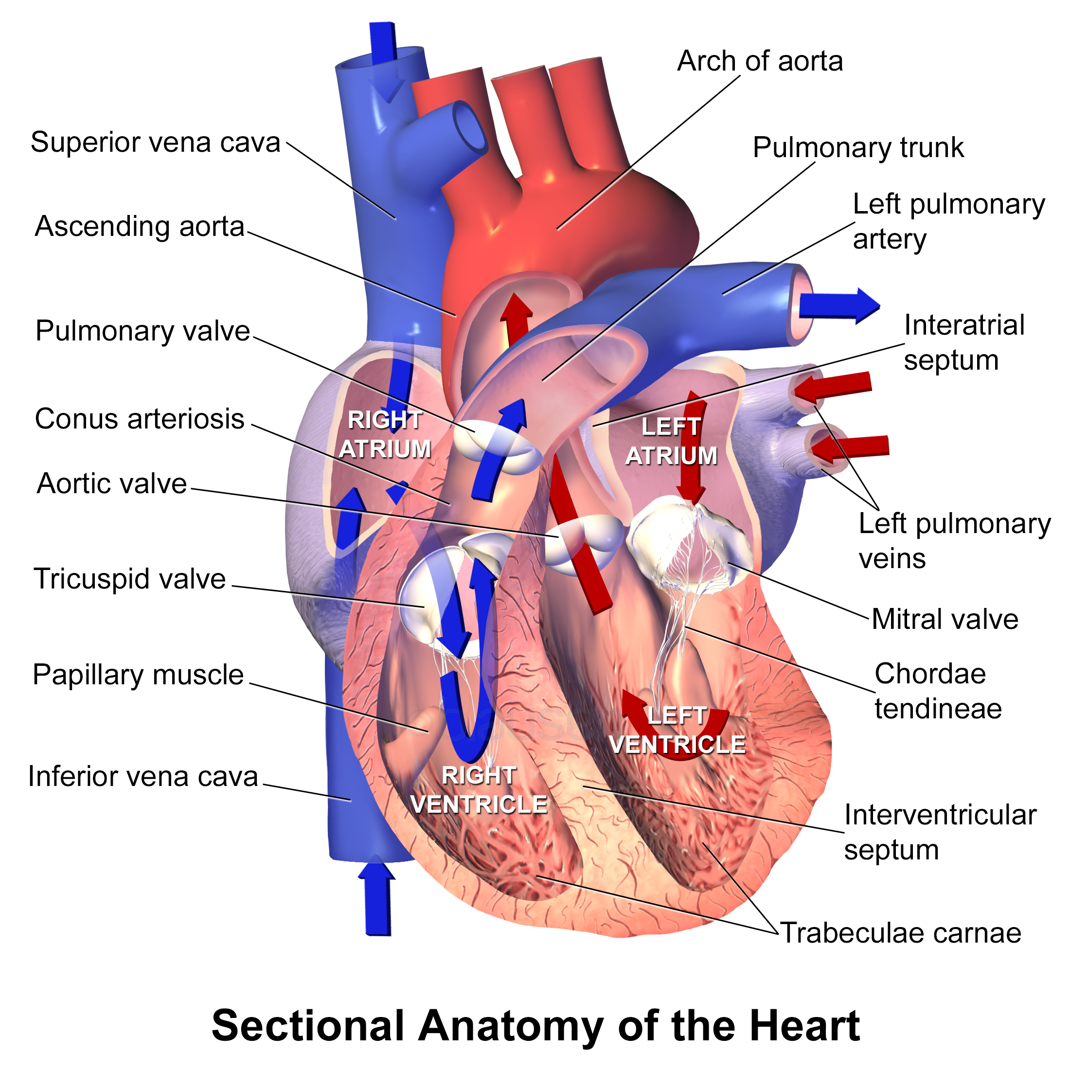
    • The ECG image is useless as nobody can interpret anything from that picture and therefore doesn't really have any need, and the diagram of the heart has far too many labels for its size making it quite cluttered
    • I wouldn't say more images would help but maybe more appropriate images would be useful
  • Key message
    • An introduction to the various cardiac investigations
Presentation 2:
  • How easy is it to read?
    • Plain simple language, sometimes too simple in that the English is not entirely correct
  • Teaching session?
    • Unless the presenter gave a lot more information then this presentation would be pretty much useless in a teaching session, students would be much better off being given one word to google and would probably get a number of different pages that would give a lot more useful information
  • Length?
    • The presentation wasn't too long in terms of content, but the content was spread over too many slides, the beginning was very dragged out as well with all the different things that resembled kidneys, I feel you would lose the audiences attention fairly quickly
  • Images?
    • Probably too many images were used in this presentation making it quite distracting and you didn't really know what exactly you were supposed to be focusing on.
    • More images would not be helpful and if anything there could be less used.
  • Key message
    • You need to look after your kidney...or else

My Storyline


PowerPoint Accessibility


A number of different linked resources relating to PowerPoint accessibility, developing online resources for people with colour blindness, a guide to creating teaching resources and an article about why we need infographics.

Although I knew that to me, a user with no issues generally with accessibility (as long as I wear my glasses that is), certain clashing colour schemes were a nightmare to look at, I had never considered people actually being unable to discern certain colours due to colour blindness. 


One of the things that struck me most in the resource on colour blindness was the map of the London Underground, something I had seen a couple of times from various trips to London.


”Sponsored” London Underground Tube Map by Annie Mole, on Flickr

This is an example of a section of that map, now being able to identify colours means you can identify which train/line you need to be on, however if you couldn't actually identify these colours...


You will then have quite a bit of trouble identifying which train to get on. 

I think I personally would then add accessibility as an important point when designing a presentation, but would not sacrifice any of my other points in order to make way for it, I think you cannot sacrifice anything to make a good PowerPoint and as you find new things to improve upon your presentation you should strive to include these and not just feel they are unnecessary because you've already done quite a bit.

Friday, May 8, 2015

Say hello to my little...men (updated)


A few character ideas for my overhead ward based scenario. Currently works in progress as I still am not very good at free hand drawing on PowerPoint a hair piece that would distinguish a character as female.

All the characters were made by myself on Microsoft PowerPoint 2013, with  the help of the resources found here: Developing my resource

This was just a play around to make characters whilst I was on the boat home from Ireland yesterday in order to see just how easy or difficult it would be. But now I've got a couple of characters prepared and it's just a case of ''CTRL + Dragging'' them and editing individual parts in order to create a whole new person altogether.

So after a bit of messing around, it seems I have now mastered the hairstyle to make my little overhead men appear to be women. Also whilst having a play around on PowerPoint I have created a rough image of a bed, however I still don't know how I feel about it yet and may want to try and make it better, but for now I feel I'm making a bit of progress on the visual aspect of my resource.


Planning cont. (Days 3 & 4)

Getting closer now, until I finally begin actually designing this resource. I genuinely don't think people understand that there is actually such a degree of background work that goes into producing a usable resource that is actually beneficial.

I have been asked to have a think about the clinical problem I am going to focus on for my learning resource. In my case I think I am going to have a run through scenario in the management of a transfusion reaction, as we normally are told the science behind it but never the actual management steps that we need to take other than in one session in clinical skills. So I thought it would be useful to have this scenario to work through in a safe environment with instant feedback.

A mild/moderate acute transfusion reaction will be the focus of my resource as the patient could present with a complaint as generic as an itch or a fever, or even just a sense that something just isn't right, so the student/doctor needs to be aware that this person is receiving a blood transfusion and is therefore at risk of developing one of these reactions.

My Blood Transfusion Mind Map
The number of different sites and pages that I have visited in the past day alone in order to find different pieces of information to even provide a brief overview of a transfusion reaction would be quite overwhelming if I didn't have a useful way to deal with all of them.

Fortunately in my previous SSC I was introduced to Mendeley where I could save websites and articles with the click of a button on Chrome. Mendeley has the added bonus of creating reference lists and possesses an extension for Microsoft word which allows me to add my references and keep track of all those that have been added really simply. It also means that if I am going back over my essay and realise I need to add a new reference between two existing references (an absolute nightmare with vancouver referencing normally), Mendeley automatically adjusts the numbers of the citations to account for this. Basically just a brilliant little tool to have, I'm just disappointed I didn't know about it sooner.

After checking out #FOAMed I thought I would share one of the cooler things that I managed to find on the page, currently unsure whether or not it is actually appropriate to share this on my blog however after checking and confirming it will be up here quick as I can, as I personally thought it was pretty cool and hopefully everybody else does too.

So the idea behind my learning resource scenario is finally coming together and it seems I'm getting closer and closer to actually making it, however hopefully having done plenty of appropriate preparation I shouldn't run into any issues when actually designing the resource.

Until next time...

Wednesday, May 6, 2015

Preparation (Day 2)


Blugh copyright and creative commons. I remember this lecture when we had to design ISS learning resources in 2nd year. I wouldn't normally have anything against it, other than the fact it restricts me from using the majority of great pictures available.

Our activity for the day was to attempt image searches that are 'free to use and share'


I mean thanks to wikipedia there are definitely a lot more free to reuse images available, but still you are greatly restricted once you make the conscious decision to not infringe on copyright laws.

Add a transparency filter to the search however, and basically say bye bye to many of the great diagrams that are available and you're stuck with mostly just cartoon hearts rather than anatomical ones, which maybe aren't so bad if you're planning to have a funny slide. 

I think personally I'd rather search for images that are modifiable and then use the remove background tool on Powerpoint, or at least attempt this first and if it doesn't provide good results then attempt the transparency filter.

My consent form would need to cover the vast array of areas that this learning resource would be available, be it national/international medical schools, just the University of Dundee, or totally public regardless of whether you're in the medical profession or not. It would also involve a pretty in depth conversation about what consenting to this would involve.
Collaboration - Chris Lott https://www.flickr.com/photos/fncll/145149313/in/photolist-dPVQn-ryp2qh-8Wjd3U-8WqRZN-qsXzSH-bmTcy7-3JJMWz-8PLu2a-8U38eb-8PpkQt-8PtBvS-8X6U3j-qsXJct-s5dtWc-8X6U35-93jnYo-4S4YJg-9EcHgC-7ecxTj-9ad9Pe-9Qz9WZ-r6jYN5-7FH6bY-91WSP7-8n3Cg8-6KBbAk-vGtnn-exXuEK-c4zefQ-9dyrJ6-91WZKG-aPWeJ-77vKw8-cTuWJL-r1wTJJ-3Kx1Vx-duMEYb-72vDN7-reArDw-8y9LbK-qziGki-5MpRG7-psnrxW-hoJ6Lj-ac5iB6-8WdP68-4yin56-4a4Ad2-qXvRBe-bBLYiv/


Planning (Day 1)


Exams are over and here I am (currently in Ireland), having reached the last 4 weeks before summer on my SSC Dr as a Digital Teacher. Really looking forward to 'attempt' to develop a learning resource over these next few weeks that hopefully will be of benefit to others. It is at this point I now need to really start thinking about what type of learning resource I'm going to develop and what topic I'm actually going to base it on.


Stay tuned to this page to find out how it goes, I'm sure it will be an interesting journey for all of us...

 
biz.